
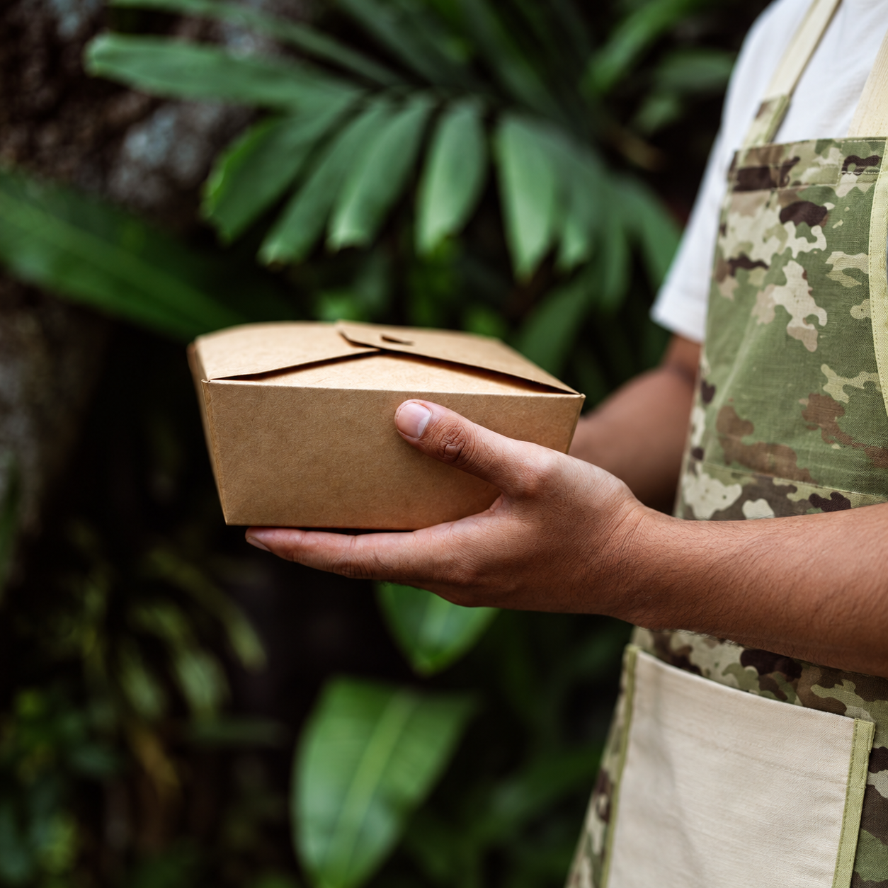
A takeaway order is a piece of the restaurant moving through the city. It is carried on the street, opened at a desk, shared at home and photographed far beyond the room in which the brand was first imagined.
That makes packaging more than a container and more than an advertising surface. It is a mobile part of the hospitality experience.
When it is developed separately from the interior, menu and service, the identity often becomes flatter the moment it leaves the door.
The experience should not end at the threshold
Inside a restaurant, identity is supported by architecture, lighting, music, tableware, uniforms and human interaction. Takeaway has fewer tools. Material, form, color, typography and the act of opening must carry more of the experience.
The objective is not to reproduce the interior on a box. It is to identify what is essential about the place and translate it into another format.
That may be a particular color rhythm, an illustration, a tactile material, an unexpected closure or a small message revealed during opening. One recognizable gesture can communicate more character than covering every surface with a logo.
The strongest takeaway systems feel connected to the restaurant without becoming miniature advertisements for it.
Begin with the journey, not the packaging catalogue
Before choosing a bag, cup or container, follow the complete journey of the order.
What food needs to be protected? How long will it travel? Will it be collected by the guest or handled by a delivery service? Does it need to retain heat, release steam or keep different components separate? How will it be carried, stacked and stored?
A format that works for a five-minute walk may not work for a forty-minute delivery. Crisp food, sauces, baked products and chilled items all behave differently in transit.
The journey also includes the restaurant team. Packaging must be quick to assemble, simple to identify and easy to close correctly during the busiest part of service. If an attractive format requires too many steps or occupies excessive kitchen space, it will create inconsistency when pressure increases.
Good packaging begins with the food and the people handling it—not with the available printing area.
Design a family, not a collection of individual pieces
A bag, cup, napkin, food box and label are rarely seen alone. They arrive together, each with a different size, material and printing limitation. Designing one impressive item without considering the rest can create a system that fragments as soon as an order contains several formats.
A coherent family needs a few clear rules:
- A limited palette that can be reproduced across different materials.
- A hierarchy for the logo, illustrations, patterns and essential information.
- Recognizable graphic gestures that work at several scales.
- A defined relationship between permanent elements and seasonal variations.
- Enough flexibility to introduce new formats without redesigning the entire system.
Consistency does not mean making every object identical. Some pieces can be expressive while others remain quiet. The role of the system is to make those differences feel intentional.
Test the constructed object
Packaging is three-dimensional, but it is frequently designed only as flat artwork.
Folds, seams, handles, closures and labels change what the guest actually sees. A graphic element that appears perfectly positioned on a digital template may disappear beneath a flap or become misaligned when the container is assembled.
Prototypes should always be reviewed in their final form.
Fill them with the real product. Close them. Stack them. Carry them in the intended bag. Leave them for the expected travel time and open them again. Check for leaks, condensation, movement, loss of temperature and damage to the presentation.
Observe where hands naturally hold the object and which surface faces the guest first. Test whether labels can be applied consistently and whether staff can distinguish similar orders quickly.
The prototype should prove that the design works, not simply show how it looks.
The opening is part of the meal
The order in which a guest encounters the contents creates a small piece of choreography.
What is visible when the bag is opened? Are the food, sauces, napkins and cutlery arranged clearly? Can each item be removed without disturbing the rest? Does the meal still look intentional when the lid is lifted?
There should be no unnecessary obstacle between the guest and the food. At the same time, a considered detail—a printed interior, a message, an illustrated liner or a well-designed label—can create a moment of recognition.
The best opening experiences feel intuitive. They do not require instructions or excessive layers to appear special.
Production constraints are part of the design
Every format has technical limits.
Paper, board, plastic, textile and adhesive labels reproduce color differently. Printing methods affect detail, coverage and cost. Folds and cutting tolerances influence where artwork can be positioned. Food-contact areas may restrict inks, finishes or decorative applications.
Minimum quantities also vary significantly. A standard container with a custom label may allow a smaller initial order than a fully printed or structurally bespoke format.
Before approving the design, the team should understand:
- Minimum order quantities for every component.
- Sampling and printing setup costs.
- Production and replenishment lead times.
- Storage requirements.
- Color and placement tolerances.
- Packing, freight and delivery conditions.
- Whether individual pieces can be reordered separately.
These are not administrative details to resolve after the creative work. They shape which solution will remain viable after opening.
Material choices require honesty
Sustainability cannot be solved by changing the color of the paper or adding an environmental claim.
Material decisions need to consider food safety, performance, local disposal systems, coatings, adhesives and the likelihood that an object will genuinely be reused.
A package described as recyclable may not be recyclable everywhere, particularly when several materials are permanently combined. A reusable object is only useful if guests want to keep it and if its quality supports repeated use.
Often the most responsible decision is also the clearest: eliminate unnecessary layers, reduce the number of components and select formats that can serve several menu items.
Using less material does not require a weaker identity. A confident design system can create recognition with fewer gestures.
Five questions for the brief
- What food must each format protect?
- How and for how long will the order travel?
- Which pieces normally appear together?
- What aspect of the restaurant identity is worth carrying outside?
- What should happen to the packaging after the meal?
These questions connect creative direction with operational and environmental reality.
A brand in circulation
Takeaway has a public life that the interior does not.
It enters homes, offices, cars and streets. It may introduce the restaurant to someone who has never visited, or bring back the feeling of the place for someone who has.
This visibility is valuable, but recognition should be the result of a coherent experience rather than the repetition of a logo.
When the interior, tabletop, uniforms and takeaway system are developed from the same central idea, the brand does not divide into separate versions. It adapts to different situations while retaining its character.
The interior creates a place. Takeaway allows a meaningful fragment of that place to travel.